One of my favorite things about professional wrestling is when a wrestler's personality is so strong that it becomes a brand all its own. Few people embody that better than WARHORSE.
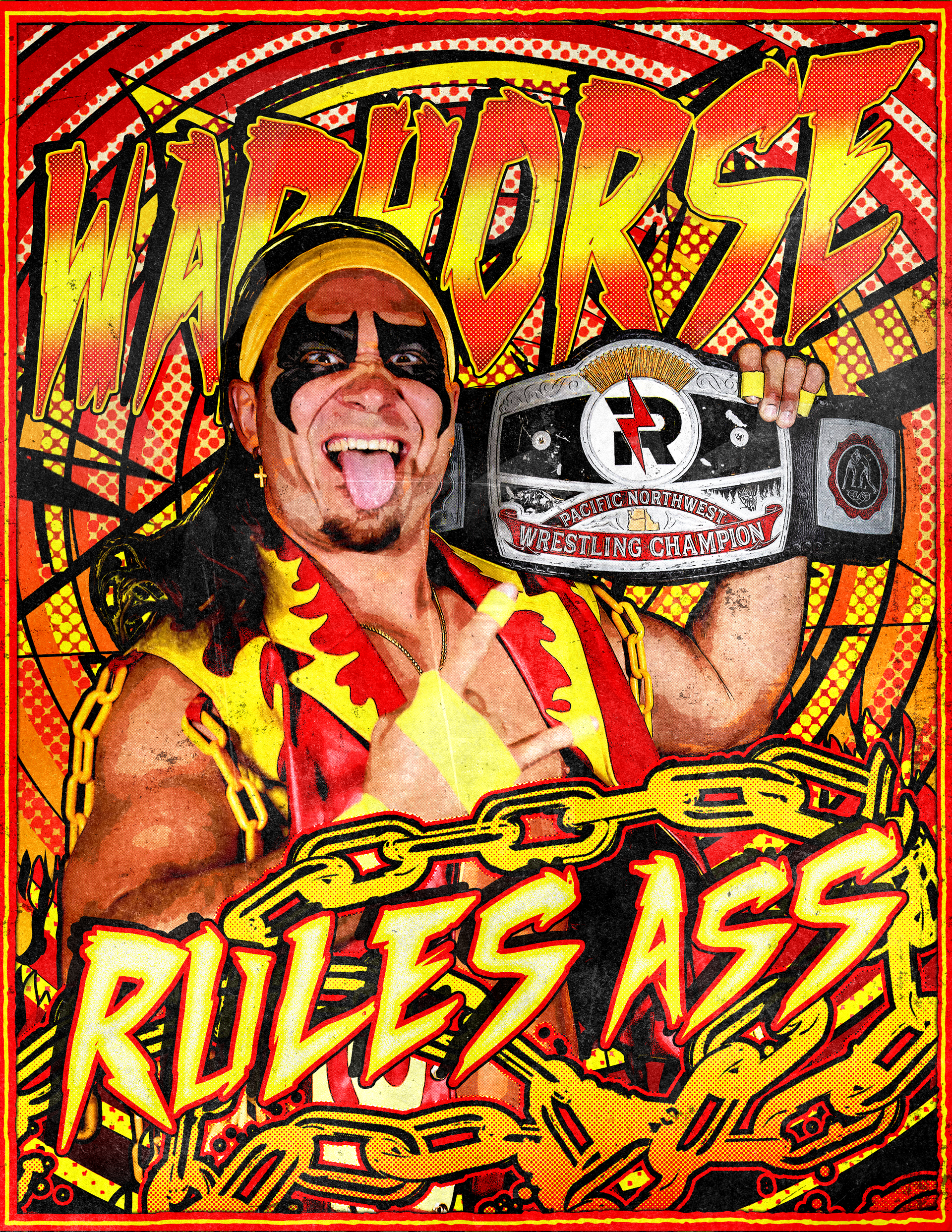
With a unique blend of heavy metal, comic books, and pure chaos, WARHORSE built a larger-than-life identity that felt like it was pulled straight from the notebooks of every weird kid who grew up in the 90s. As someone whose own design style draws heavily from those same influences, it felt like a perfect creative fit.
Over the next several months, I had the opportunity to create everything from promotional graphics and 8x10s to merchandise and branding materials. It was the kind of project every designer hopes for: a character whose visual identity aligned almost perfectly with my own creative instincts.
There was just one little problem.
He turned heel.
For the non-wrestling fans in attendance, turning heel means going from a beloved hero to a despised villain.
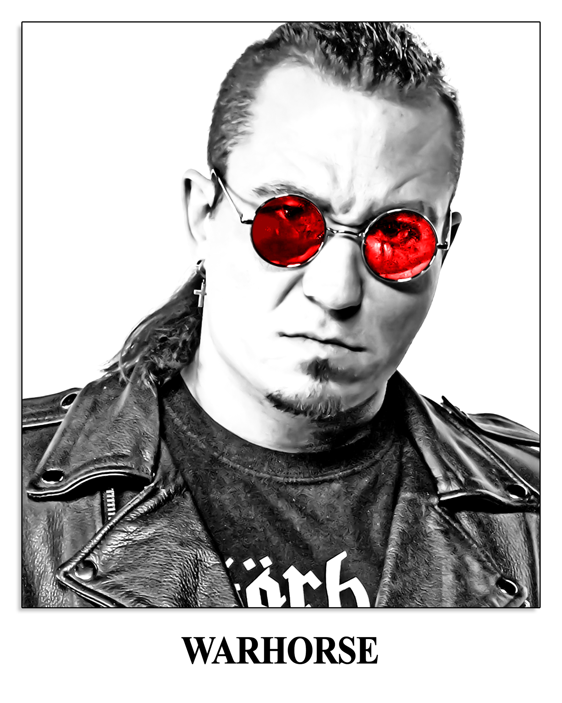
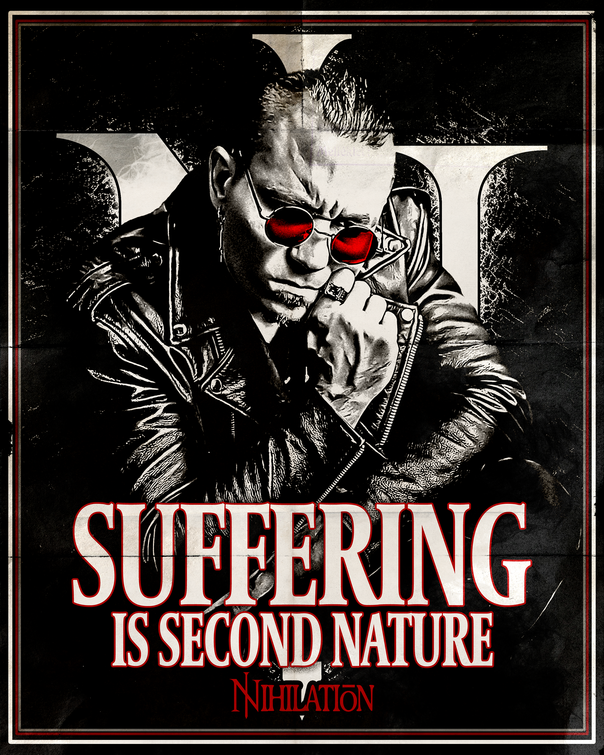
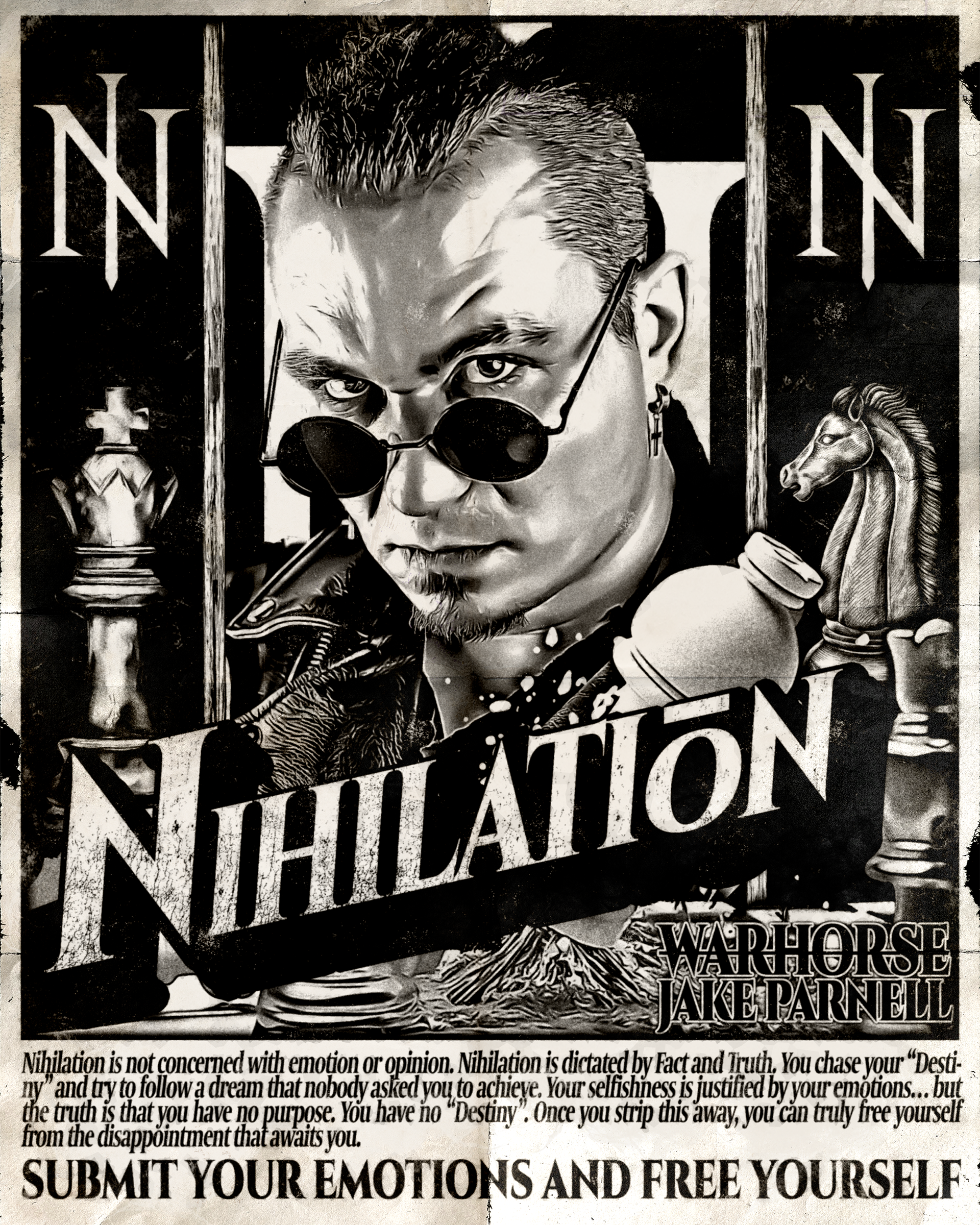
In WARHORSE's case, the transformation was dramatic. Gone was the loud, larger-than-life rockstar who charged to the ring in a blaze of red and yellow. In his place was a nihilist who believed nothing mattered. The bright colors were replaced with blacks and greys. The heavy metal spectacle gave way to quiet resentment.
As a designer, this presented a unique challenge. Much of my previous work with WARHORSE had been built around amplifying the character's energy and chaos. Suddenly, I was being asked to design for someone who wanted the exact opposite.
I knew I was in trouble when I asked him what font he wanted to use for a new project.
His response?
"Times New Roman."
I went from a project that was my creative comfort zone to anything but.
It wasn't easy at first. I had to fight nearly every instinct I had about how WARHORSE should look. There were countless early concepts where I found myself pulling the chaos back further and further.
What finally clicked was realizing I wasn't the only one trying to figure out who this new version of WARHORSE was. WARHORSE himself was still discovering the character. Instead of designing for a fully realized brand, we were building one together in real time.
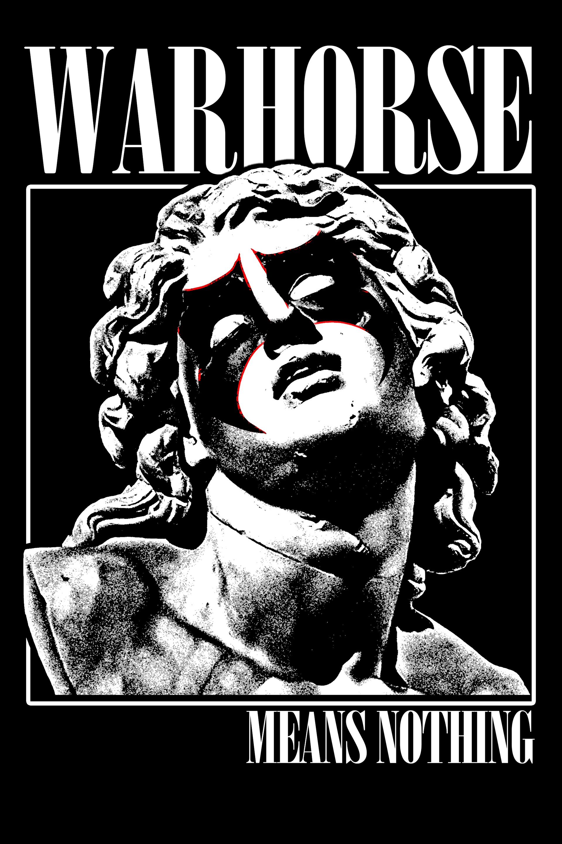
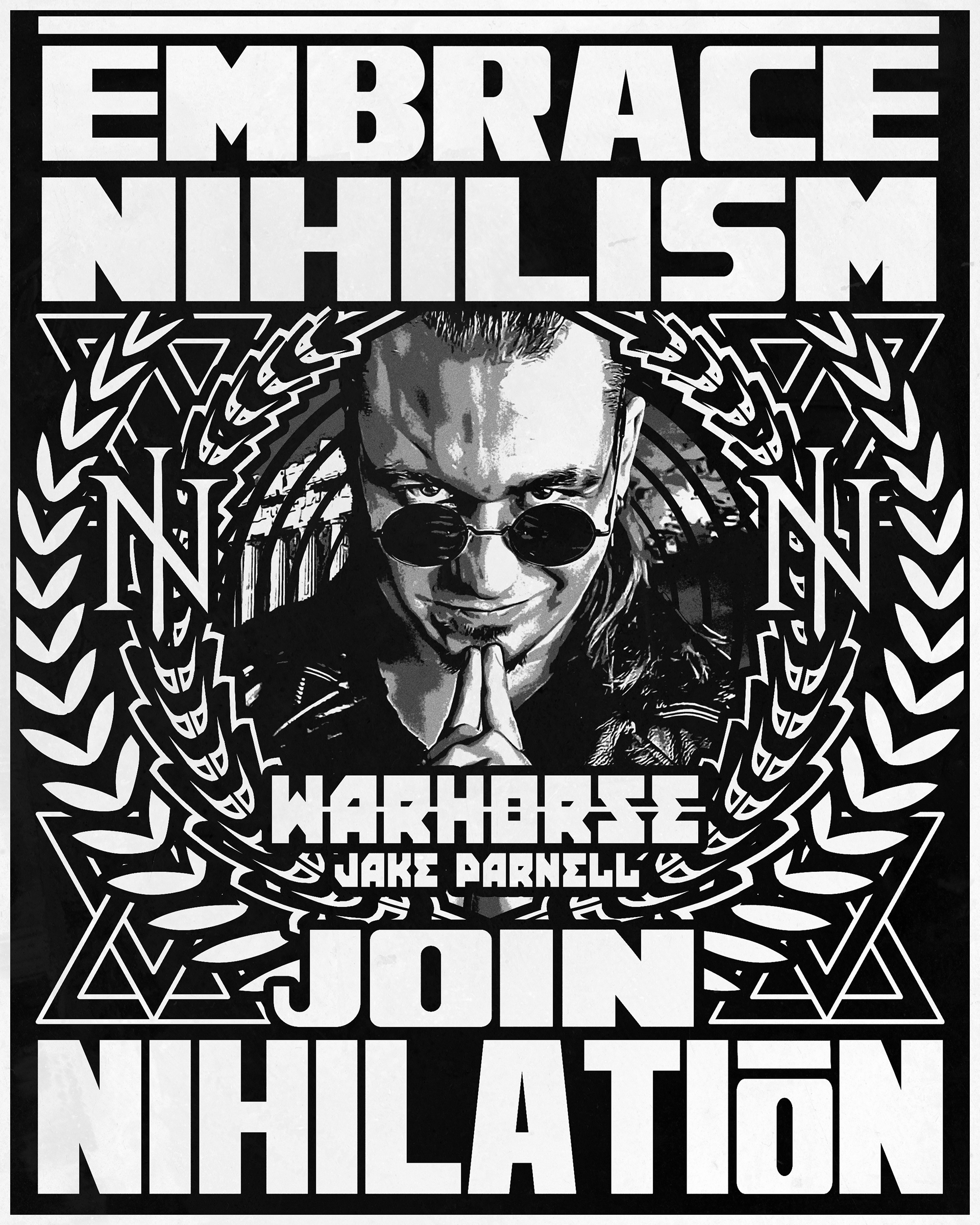
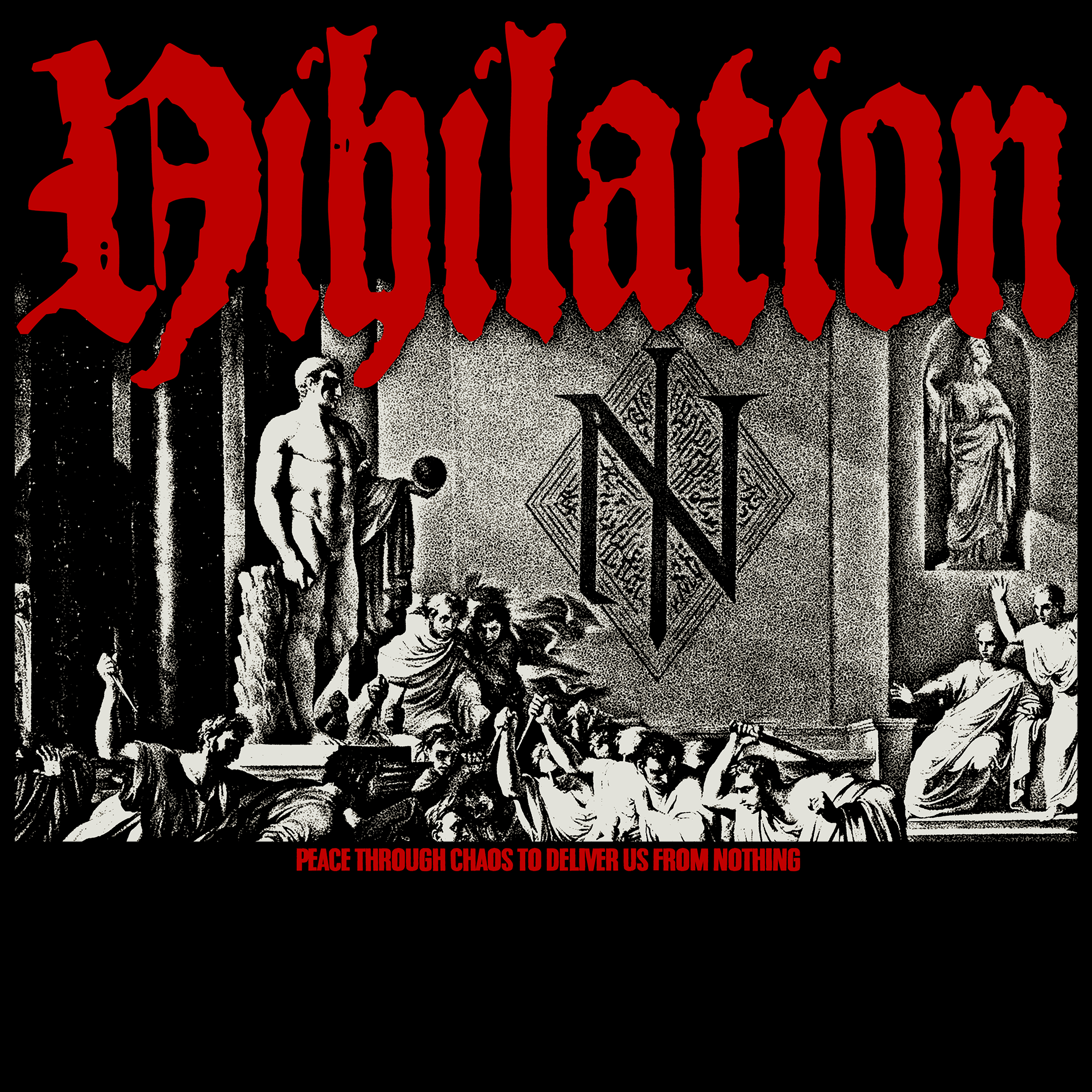
As the vision became clearer, so did the artwork. WARHORSE wasn't just becoming a darker version of himself—he was becoming a cult leader, determined to drag everyone around him into the same nihilistic worldview. Meaning we weren't just designing merchandise.
We were making propaganda.
Posters. Recruitment materials. Symbols. Messaging. The kind of imagery designed to spread an idea rather than celebrate a hero.
For the first time since the rebrand began, I felt like I understood where the character was headed. More importantly, I finally understood how to get him there.
In the end, Nihilation worked because I finally stopped trying to design for the WARHORSE I knew and started designing for the WARHORSE he was becoming.
Once that clicked, the entire campaign opened up. The propaganda posters, the monochromatic artwork, the cult imagery, and the messaging all began flowing from the same place. For the first time, the character felt fully realized.
Looking back, many of my favorite pieces from this project are the ones that scared me the most when I started. They weren't louder. They weren't more chaotic. They were simply different.
Turns out the best thing that could have happened to this project was a heel turn.